19 April 2012

Nobody cares about foreign policy

Above is a screenshot of the navigation bar from the Obama 2012 Web site.

What's really remarkable about this is that the only mention of international topics comes under the rubric "National Security."

I'm hardly a subscriber to the securitization literature, but there really does seem to be something to the fact that the Obama campaign--which is presumably thinking about how to attract liberal and independents--doesn't think about "Foreign Policy" as a valuable tool to that end. Instead, it thinks about "National Security."

There are two points to be made here for students of international relations.


09 April 2012

Drinking To Prosperity and Freedom [Updated]


The sound, taste, and look of freedom and prosperity.
A Bavarian barmaid serves beer during Oktoberfest.
Source.
There is absolutely no reason in the world why I should be asking about the relationship between alcohol consumption and prosperity, human rights, and democracy.

On the other hand, there's data! Thanks to the WTO, it's actually possible to do the sort of social science that horrifies PTJ but which involves numbers and statistics. Ergo, it's science.

So, I start with a simple question. Why do countries vary in their consumption of alcohol? We might think that there are two competing theories. The first is that alcohol consumption is largely culturally determined; the second is that alcohol consumption is a normal good, subject to the sort of demand and supply curves that affect all other goods.


From the first, we might deduce further that more politically liberal countries will see higher alcohol consumption; similarly, countries with more conservative religious traditions--which I operationalize, largely on the back of the envelope, as percent Muslim--will drink less. From the second, we deduce that richer countries will drink more.

(There will be no broad conclusions here, as I largely just wanted to have some experience merging datasets and playing around with some packages in Stata and R.)

We start with exploratory graphs. [UPDATE: I added a second plot, which I think is a little nicer.]

Plot shows alcohol consumption plotted against per-capita GDP.
Alcohol consumption statistics come from the World Health Organization.
Polity Score and Percent Muslim from the Quality of Government dataset.

Plot shows alcohol consumption plotted against per-capita GDP.
Polity Score and Region from the Quality of Government dataset.


08 April 2012

The price elasticity of labor-saving devices

Andrew Gelman passes along a great chart (via here and originally here):

In his post, Gelman praises the cleanliness of the graph, and I think that's fair--it's pretty. However, it's not obviously a great data visualization, since neither the color nor the type of the lines used convey any information beyond making the graph readable, which seems a waste (couldn't the colors had been chosen based on time-to-80% adoption or something?).

Like others, however, I find this a useful spur to thinking. In my case, looking at the S-shaped curves of adoption for most (but not all!) technologies, I thought of diffusion theorizing. In this case, what seems to be driving differential adoption rates is first the fact that relative prices for all of these innovations have fallen really far as per-capita GDP has risen and prices for manufactured goods have fallen. (Consider the "computer" in this context, which has surely changed the most of all of the innovations over time.) 

Second, what is most obvious (to me, anyway) is the profound labor-price elasticity here. 

07 April 2012

I don't think that word means what you think it means

Dear The Atlantic: "Matters" does not refer to anything in that box. Please adjust your editorial standards accordingly.

A Magnum is a period piece

One of the constants in my somewhat protean political affiliations has been a siding with what Europeans conceive of as an American form of justice--which is to say, something that approximates the criminal justice standards prevailing in late nineteenth-century Texas. The less-famous monologue from Dirty Harry expresses this pretty well:
[Harry is getting a dressing-down for his most recent arrest
District Attorney Rothko: You're lucky I'm not indicting you for assault with intent to commit murder. 
Harry Callahan: What? 
District Attorney Rothko: Where the hell does it say that you've got a right to kick down doors, torture suspects, deny medical attention and legal counsel? Where have you been? Does Escobedo ring a bell? Miranda? I mean, you must have heard of the Fourth Amendment. What I'm saying is that man had rights.
Harry Callahan: Well, I'm all broken up over that man's rights! (Source)
So, yes, I like Dirty Harry even as I recognize that this pretty much makes me side with some fairly far right-wing affections. Of course, the world of Dirty Harry is right-wing pornography, in which "git tuff" policies actually work and criminality is a consquence of a diet low in moral fiber.

Now, that being said, it is a great work of right-wing pornography. And that is why I'm delighted to find Dirty Harry Filming Locations, which puts the film into real perspective.

Update: I'm following Dirty Harry with The Hunt for Red October, which is a similarly inflected film about honor, duty, and misguided liberal social systems. That's a joke. But the opening few minutes--with the "Hymn to Red October"--kind of makes me yearn for the bad old days.

28 March 2012

Leaving Gotham

This is an ad for Obama. It could easily
be an ad for Domino's pizza. As a party
game, count the number of fonts: I see
five, which is the same number of
angels who wept when they saw this jpg.
Among the many disappointments of the Obama administration is its abandoning of its once-favorite typeface, Gotham.

The Obama 2008 campaign's masterful handling of typefaces in branding the then-Illinois senator's campaign. Gotham is a magnificent font, summoning the best of the industrial-era firmness and streamlining of Art Deco with a mature and inspiring mixture of informality and strength.

It was perfect.

Therefore, Obama abandoned it.

At left is a Web advertisement from the New York Times. It is a travesty as shameful as the solicitor general's performance in oral arguments yesterday. It is needlessly filigreed, polluted by multiple typefaces, and inconsistent in its color schemes. Even the familiar Obama "O"--once the central point of the brand's visual identity--has been reduced almost to illegibility.

The White House Web site is, if anything, even worse.


If you use six typefaces on your home page, the terrorists have won.

Gotham makes a cameo in the bottom right, but the remainder of the Web site uses a mix of Georgia, Arial (goddamn ARIAL!), and some custom font I don't recognize. (In some circumstances, the designers were unclear whether they wanted serif or sans serif; the css sheets reveal that the order for certain elements is Georgia, then Arial or Helvetica, and then Verdana. Why not just use Comic Sans, Barack?)

The most glaring flaw, of course, is that terrible, Fox News-style red white and blue banner for "West Wing Week." It's bad enough that the Obama Elegant font for "West Wing Week" at top left places a weird visual emphasis, such that it reads as WEST WING WEEK, but the boring, Microsoft Word-looking sans serif banality of the banner is a betrayal of Jesus, NASCAR, and the Statue of Liberty.


25 March 2012

Global Divergence And Convergence

Let me talk about something I admit I know very little about to ask some questions I'm not sure IR has any good answers to.

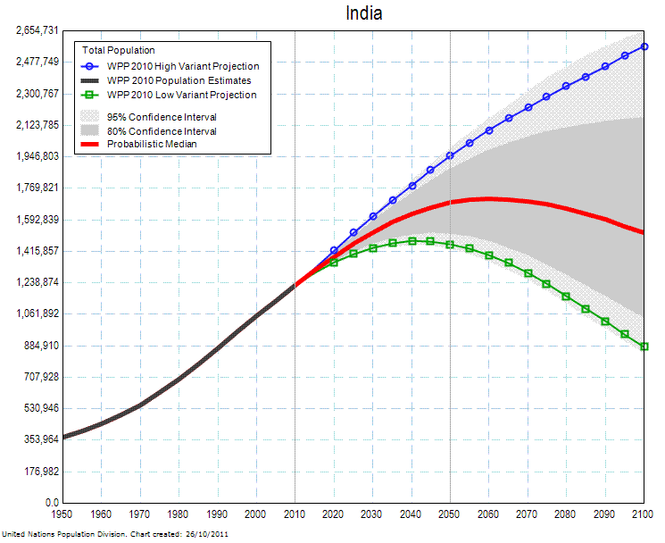
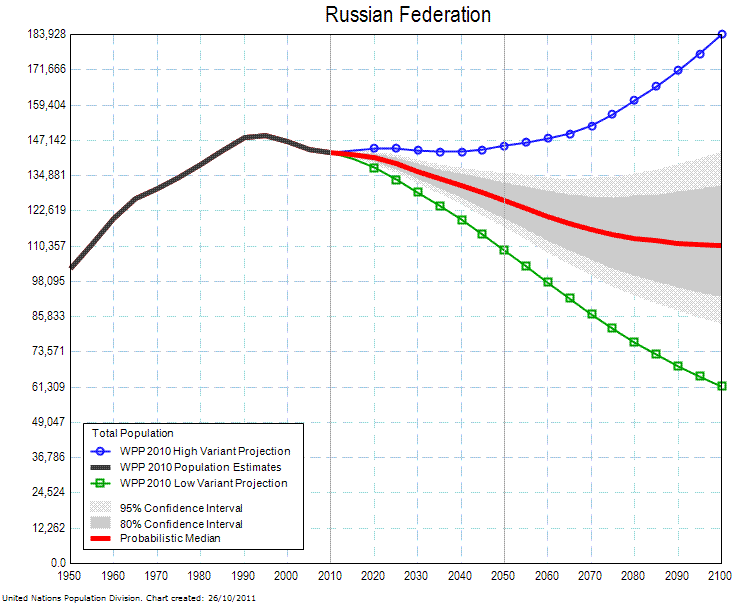
The United Nations projects that over the coming century the global balance of population will radically shift, with Asia losing its longtime status as home to a majority of the world's population and Africa rising quickly to account for somewhere around a third of humanity, an increase from about 15 percent today. Individual countries show the trend in detail fairly well:


As is well known, China's fertility rates are being artificially depressed, while India's remain high. Consequently, it is likely that India will surpass China's total population, which is likely to peak sometime in the next twenty or thirty years, and will become the most populous country on earth by mid-century. What is unknown is just how populous India will be in 2100--the UN gives a range between about 900 million and 2.6 billion, which is to say that the UN's demographers have no idea.


What is less well known is how quickly many African countries are growing. Nigeria and Tanzania are forecast to be among the five most populous countries by the end of the century, and the UN's estimates for Nigeria (pictured) are, again, almost no help: the UN's mean forecast is that Nigeria's population will be about 650 million in 2100, but the range is somewhere between 275 million and 1.2 billion -- a margin of error roughly the size of Africa's total population today. (Even if we restrict ourselves to the 95 percent confidence intervals, we are still left with a range between 425 million and 1.1 billion.)


For countries in the developed world, which for these purposes temporarily includes Russia, we have better understanding of how fertility is likely to behave, and so we can forecast demographics a little bit more precisely. The United States will continue to grow over the coming century, with a population mean forecast of 450 million and a range between 375 and 525 million, while countries such as the UK, France, and Italy will stay roughly in their current weight classes. Russia, by contrast, will almost certainly lose population.

How does international relations respond to challenges such as divergent population growth? Over the past century, such complications have been ignorable, because poor countries were normally also relatively small (Europe long accounted for about a quarter to a third of the world's population) while also fairly weak. But for the next several decades many such countries will be both growing their mass population while also growing their per-capita GDPs at rates that vastly outpace the Industrial Revolution.

I've put together another figure which shows changes in GDP per capita for selected countries and regions over the past millenium to illuminate the scale and speed of the changes we're seeing in global economics.

(The line for Western Europe and its colonial offshoots, such as the USA and Canada, is almost identical.)

This figure demonstrates that the past two centuries have been a period of exceptionally strong divergence between the "West" and the "Rest." It also suggests that this period is drawing to a close--for the first time since World War II, Western Europe's lead in economic development over the rest of the world is eroding, while for the first time since the early Qing Dynasty, China's GDP per capita is approaching the global mean.

The notion of the "developed" world is one that has also proven malleable over time. Portugal, for instance, was a charter member of the OECD, but its economic development looks downright stagnant compared to South Korea. And, of course, Japan famously became the first non-Western nation to achieve Western levels of technological and economic development.


So what does a world in which Europe is a rounding error look like? What happens when the Atlantic Community is less a security community and more a gated community--a small neighborhood of wealthy and aging people whose borders are patrolled by heavily armed guards? Do states that are growing so rapidly and yet have comparatively few resources behave in the same way that realism or liberalism expect? UPDATE: A better way of asking this is: Are our theories of IR as scalable as they purport to be?

I'm not sure that our theories of international relations have properly specified their operative assumptions in full.

23 March 2012

Jobs: The fundamental metric of political worth

As election cycle heats up, my email inbox fills up with solicitations and denunciations from rival campaigns. Interestingly, it appears that candidates from both parties have converged on a solution to one of mankind's longest-standing philosophical problems: how to measure the intrinsic worth of political action.

This puzzle, which bedeviled Aristotle, Augustine, Machiavelli, Hegel, and Rawls, has a beguilingly simple answer--at least if contemporary American political advertisements are to be believed. It turns out that all policies, initiatives, actions, and elections can be judged according to one criterion:

Jobs.

A good policy is one that creates jobs. A bad policy is one that destroys jobs.

So simple! Were you worried about a policy's coarsening effect on the moral sensibilities of the country? Immaterial, as long as it creates jobs. The moral justification for launching a war of choice? Irrelevant, since the war creates jobs! The demise of public-spiritedness as our economy becomes a series of tournament-style rewards? It's only bad if it destroys jobs!

So, World War II: Very good. It created a lot of jobs. The American Revolution was probably bad, since it destroyed many jobs. The Civil War was good on a technicality: It created jobs, although in doing so it ruined many Southerners' asset portfolios, which otherwise would have been a bad thing. The Civil Rights movement? Neither good nor bad, since it had a net zero impact on jobs.

Some people have suggested that we might divide jobs into "good" or "bad" jobs, but this distinction--once prevalent--has long since disappeared. So we can no longer worry about whether good jobs are destroyed in favor of bad jobs. Because the only thing that matters is jobs.

21 March 2012

Of budgets and values

It is shockingly hard to come up with an image
to accompany a post about budgeting.
Budgets are beautiful.

Gordon Gekko's motto--"Greed, for lack of a better word, is good"--was willfully contrarian but hardly persuasive. Greed has the virtue of predictability, but it is not good unless incentives are extremely implausibly aligned.

But budgets are beautiful.

Budgets are beautiful because they are stark and truthful. They tell you everything you need to know about an organization. Does the organization assign resources politically or logically? Does the organization think hard about planning for contingencies? Does the organization recklessly commit all of its funding with no reserve?

Budgets are especially beautiful when they are based on lies.

Consider what Enron's balance sheet said about the organization. The budget was based on lies, and because it was based on lies you could tell that the organization was based on lies. A management that has to lie to make its numbers is an organization that's condemned to fail. (Although not necessarily quickly.)

But it's impossible to make those lies last forever. Eventually, revenues have to meet expenses. And eventually assets (and equity) have to total liabilities.

Organizations do lots of things that aren't beautiful, because they don't have to be true. Organizations sponsor charitable works, even when those organizations' missions are the antithesis of charity. Organizations pass resolutions declaring that they're in favor of women or civil rights, even when those organizations are opposed to both. And organizations say they hire and promote on merit, even when all the top-ranked people in an organization look and sound the same because they're from the same school, same town, same class.

But budgets can't be hypocritical. An organization either spends what it has on a priority or it doesn't. Budgets, therefore, are the ultimate statement of an organization's real values. If an organization values foresight and preparedness, the budget will reflect that. If it's a risky and venturesome organization, the budget will reflect that, too. And if the organization is rotten to its core, then the budget will reveal that, too.

22 February 2012

What's the count in the American empire debate?

As part of a project I'm working on this term, I ran these Google Scholar n-grams for a professor. (They aren't the first or even the most impressive ones I've run, but they are the ones that I'm most behind on sharing.)

The first corpus is a broad overview of the frequency of the use of the term "American empire" in Google's corpus of American English.

"American empire", corpus: American English, 1850-2008

What emerges is a somewhat surprising pattern: There's a long decline over the nineteenth century, a blip following the acquisition of an actual American empire in 1898, and then a long plateau following the United States' inadvertent victory in World War I.

The decline that set in after the height of Vietnam War guilt is reversed almost immediately by the events of September 11, which sent discussions of "American empire" to an all-time high (that's right, even eclipsing the period of time when we stole--there's no other nice word for it--Hawai'i, Puerto Rico, the Philippines, and Guam!).

"American empire", corpus: American English, 1968-2008
 This trend is confirmed by an examination of the British English corpus (more discussion below).